SUMMARY
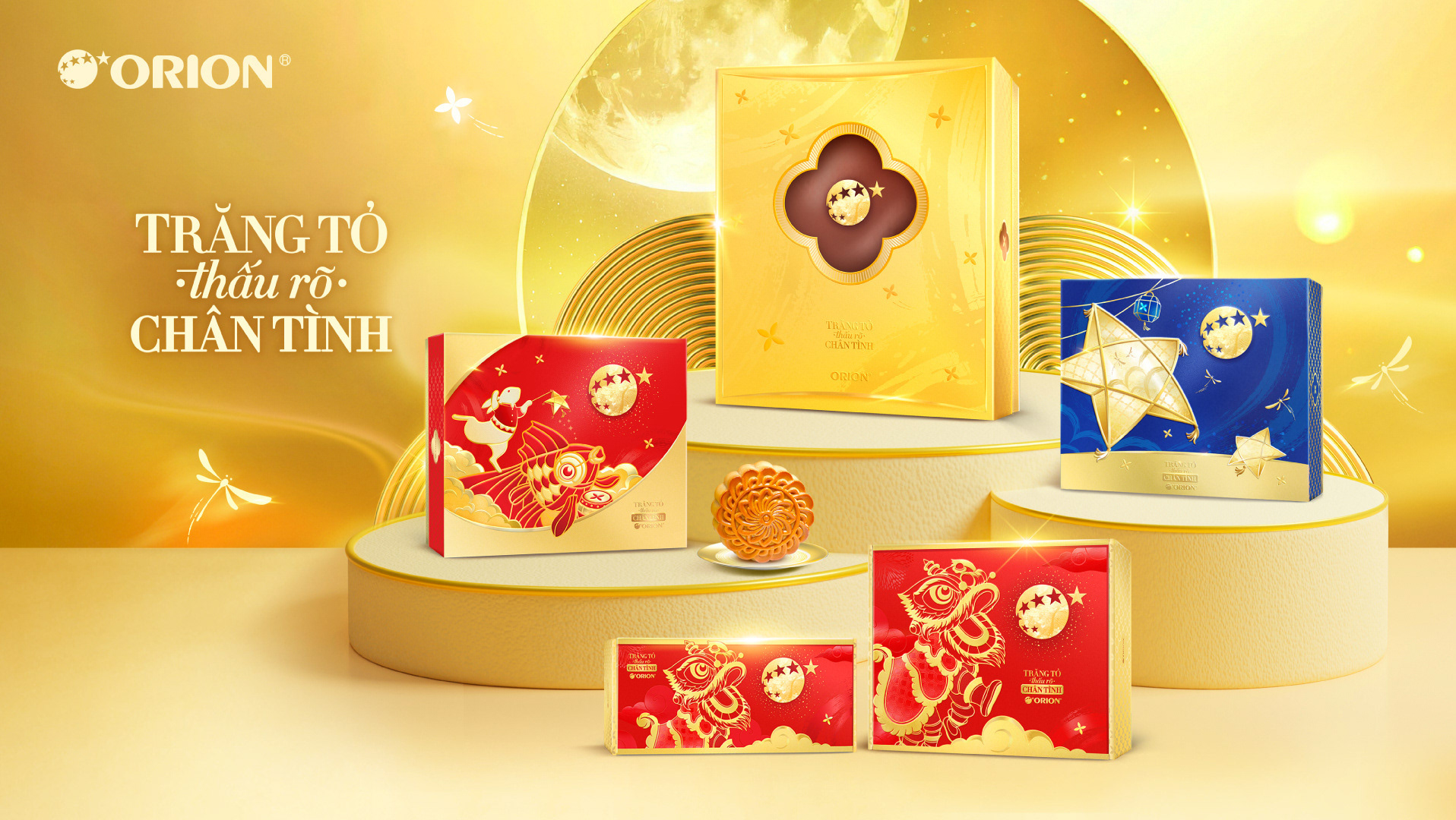
This project delivers a premium seasonal packaging concept that elevates Orion’s gifting portfolio during peak festive moments. 
Inspired by themes of renewal, prosperity, and auspicious beginnings, the design combines iconic red-and-gold color codes with refined cultural symbols to create strong emotional resonance and high shelf impact. The cohesive visual system across formats enhances brand recognition while reinforcing Orion’s role as a trusted, meaningful gift choice. 
By balancing cultural storytelling with premium aesthetics, the project supports both sales momentum in the festive season and long-term brand equity, strengthening Orion’s presence in the competitive gift and confectionery category.
INSPIRATION
The afflatus for this project draws from the poetic harmony between nature, craftsmanship, and festive symbolism. 
Flowing textures and shimmering light reference the movement of water and sky, evoking a sense of continuity and renewal. Elegant birds, florals, and jewel-toned colors are used as symbols of prosperity, grace, and good fortune, while intricate gold detailing reflects the meticulous beauty of traditional craftsmanship. 
Together, these elements create a rich visual language that feels both contemporary and timeless, transforming cultural motifs into an elevated, emotionally resonant festive expression.
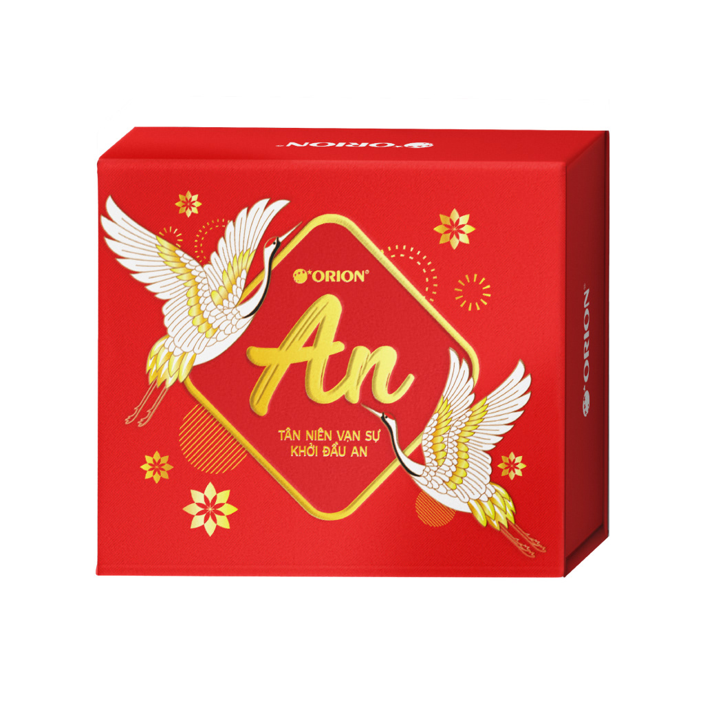
COMPLETION
The logo was refined and finalized to achieve a balance between emotional expression and brand clarity. Handwritten lettering was carefully adjusted to improve legibility while preserving a natural, human touch that conveys warmth and sincerity. Proportions, stroke weight, and spacing were optimized to ensure consistency across applications, from packaging to communication materials. 
The completed logo system allows flexible use across different festive messages while maintaining a cohesive visual identity, reinforcing the project’s theme of renewal, positivity, and meaningful new beginnings.
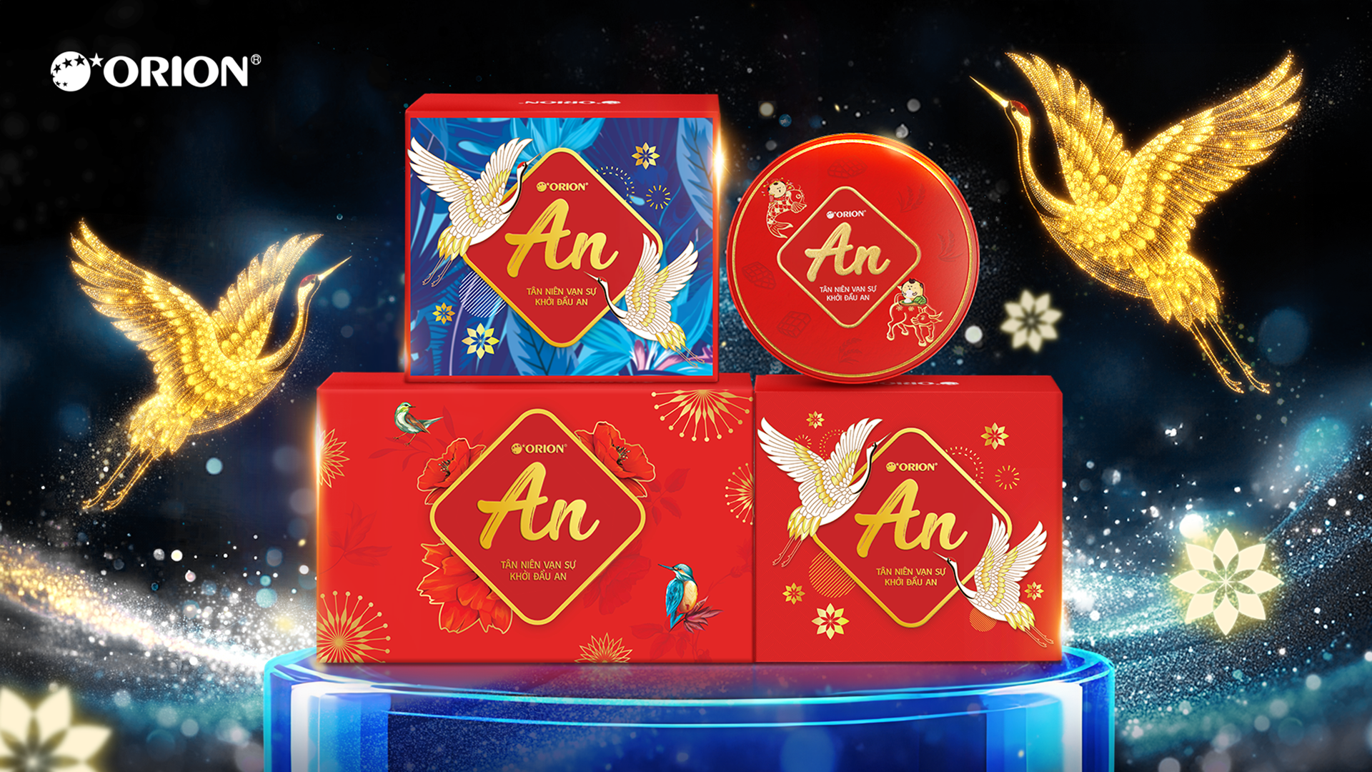
HIGHLIGHT
This project reached to maximize sales performance during the peak festive gifting season while reinforcing Orion’s brand presence. 
The bold red-and-gold color system and auspicious cultural symbols created strong shelf impact, helping the products stand out clearly in gift and confectionery displays. A cohesive visual language across multiple box formats improved brand recognition and made the range easy to identify at point of sale. 
The premium look and refined detailing enhanced perceived value, encouraging gifting purchase and trade-up behavior. As a result, the project supported higher seasonal sell-through while strengthening long-term brand awareness and association with meaningful, celebratory occasions.
AmorePacific | Mamonde Domestic Launch
[Digital Asset Delivery] This online campaign for Mamonde amplified its “Inspired by Flowers” philosophy through romantic, nature-driven visuals optimized for digital platforms. Designed to boost engagement and conversion, it strengthened brand storytelling, online visibility, and short-term sales performance.
Orion | Moon Cake New Launch
[Brand Identity System] This project set a supreme image of Orion’s Mid-Autumn mooncake collection with a refined, contemporary visual inspired by moonlight and tradition. Premium gold tones and festival motifs enhance the gifting experience while reinforcing brand values of trust, craftsmanship, and togetherness.
Orion | Marika New Launch
[Brand Identity System] This project elevates Orion Marika Flower Cookies with premium royal blue and gold packaging and an octagonal tin design. Highlighting New Zealand butter and refined mastery, it enhances gifting appeal, shelf presence, and consumer trust in quality.
Orion | Gouté Renewal Journey
[Brand Aesthetic Direction] This project marks Orion Gouté’s 15th anniversary with a limited-edition packaging design celebrating conceptual art and shared moments. Vibrant patterns and refined details elevate its premium image, reinforce heritage, and enhance desirability as a sophisticated gift choice.
Orion | Toonies Thematic Campaign
[Brand Aesthetic Direction] This co-branding campaign between Orion Toonies and Pokémon introduced 108 collectible Tazo discs to drive excitement and repeat purchases. It transformed the snack into an interactive experience, appealing to kids and nostalgic fans while strengthening brand competitiveness.
Taisun | Cozy Baby Global Launch
[Brand Aesthetic Direction] This project launched UniDry Premium’s Slim Magic Technology, highlighting its ultra-thin, high-absorption core and dermatological safety. Soft visuals and clear icons enhanced understanding, positioning it as an advanced, baby-safe solution for export markets like Australia and Europe.
Orion | An New Launch
[Brand Identity System] This project developed a key visual and packaging concept for Orion’s An Vừng, celebrating Vietnamese countryside heritage. Rustic illustrations, warm tones, and ingredient-focused visuals enhance authenticity, appetite appeal, and brand memorability while strengthening its traditional positioning in modern retail.
Orion | ChocoPie Summer Thematic Campaign
[Brand Aesthetic Direction] The “Hey!! ChocoPie đi!” project refreshed the brand by repositioning hero brand ChocoPie as a playful, multi-format dessert universe. By introducing ice cream and frozen variations, the campaign enhanced modern relevance and encouraged consumers to rediscover the brand in new, social moments.
Orion | Tok Renewal Journey
[Brand Aesthetic Direction] This project redesigns Orion Tok with bold color blocking and dynamic flavor storytelling for strong shelf impact. An interactive QR challenge boosts engagement, driving impulse purchases and reinforcing Tok as a playful, energetic brand for trend-driven youth.
AmorePacific | Laneige Annual Campaign
[Brand Identity System] This online project supported Laneige’s Shopee launch with strong e-commerce visuals and hydration-focused imagery. Designed to drive awareness, traffic, and conversion, it combined premium storytelling with clear calls-to-action to strengthen online presence and accelerate sales growth.
Back to Top