SUMMARY
This design project was developed for an online campaign marking Laneige’s official launch on Shopee. Built with a digital-first mindset, the campaign focused on creating strong visual impact across e-commerce banners and social media platforms to drive awareness, traffic, and conversion. 
The clean gradient background, fresh blue tones, and radiant model imagery reinforced Laneige’s hydration expertise while ensuring brand consistency within a competitive online marketplace. The layout prioritized clarity, brand recognition, and immediate call-to-action messaging to maximize click-through and sales performance. 
Overall, the campaign successfully combined premium brand storytelling with performance-driven design to strengthen Laneige’s online presence and accelerate e-commerce growth.
INSPIRATION
The creative inspiration for this online campaign was rooted in celebrating the luminous, refined beauty of Asian women through a modern and aspirational visual language. 
The design highlights a soft, radiant complexion as the ultimate expression of confidence and elegance, using a representative Asian model whose natural glow, delicate features, and serene expression embody purity and inner strength. 
The pastel blue and dewy light gradients were intentionally selected to evoke clarity, hydration, and translucency—key attributes associated with the ideal “glass skin” aesthetic admired across Asia. Botanical elements subtly reinforce the concept of safety and natural ingredients, while the fluid drop textures symbolize advanced skincare science and double efficacy. 
By positioning an Asian beauty figure at the center of the narrative, the campaign not only strengthens cultural relevance but also builds emotional resonance, inspiring consumers to see their own beauty reflected in the brand’s promise of bright, healthy, and confident skin.
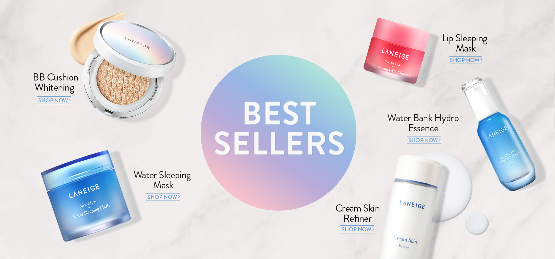
HIGHLIGHT
This design project was developed for a performance-driven online campaign spotlighting Laneige’s Best Sellers portfolio. 
The creative direction focused on a clean, conversion-oriented layout that clearly highlighted hero products while maintaining a premium, modern aesthetic consistent with the brand’s identity. A centralized “Best Sellers” visual anchor was used to immediately capture attention, while individual product placements with clear “Shop Now” call-to-actions were optimized to drive click-through and purchase intent across e-commerce platforms. The soft gradient core element reinforced Laneige’s hydration expertise, creating visual cohesion while guiding the consumer journey. 
Overall, the campaign successfully balanced brand storytelling with strong sales activation, maximizing online visibility, engagement, and conversion performance.


Orion | Tok Renewal Journey
[Brand Aesthetic Direction] This project redesigns Orion Tok with bold color blocking and dynamic flavor storytelling for strong shelf impact. An interactive QR challenge boosts engagement, driving impulse purchases and reinforcing Tok as a playful, energetic brand for trend-driven youth.
Orion | An New Launch
[Brand Identity System] This project developed a key visual and packaging concept for Orion’s An Vừng, celebrating Vietnamese countryside heritage. Rustic illustrations, warm tones, and ingredient-focused visuals enhance authenticity, appetite appeal, and brand memorability while strengthening its traditional positioning in modern retail.
Orion | Custas Renewal Journey
[Brand Aesthetic Direction] This campaign strengthened Custas’ positioning as a nutritious, fun pie for children while reassuring parents on quality. Playful visuals and bold “better nutrition” claims enhanced shelf visibility, digital impact, and purchase intent, driving both engagement and sales.
Taisun | MëdiKind Global Launch
[Brand Aesthetic Direction] This project built a strong medical-grade identity for MediKind through soft clinical design and clear, trust-focused labeling. Applied across the full baby care range, it enhances shelf consistency, strengthens parental confidence, and positions the brand as a premium, healthcare-inspired solution.
Taisun | Cozy Baby Global Launch
[Brand Aesthetic Direction] This project launched UniDry Premium’s Slim Magic Technology, highlighting its ultra-thin, high-absorption core and dermatological safety. Soft visuals and clear icons enhanced understanding, positioning it as an advanced, baby-safe solution for export markets like Australia and Europe.
Orion | Gouté New Launch
[Brand Aesthetic Direction] Gouté – The Blossoming Era is a luxury festive gifting collection celebrating renewal and prosperity. Blending traditional motifs with modern luxury design, it reinforces Gouté’s refined positioning and strengthens Orion’s presence in the high-end seasonal gifting segment.
Orion | CestBon New Launch
[Brand Identity System] The C’est Bon! Baguette project launched a European-inspired bakery breakfast meal blending French–Italian flavors with café-style visuals. Authentic taste cues and cohesive packaging enhanced shelf impact, strengthened brand recognition, and positioned it as a refined yet accessible indulgence.
AmorePacific | Sulwhasoo Global Launch
[Digital Asset Delivery] This online campaign highlights Sulwhasoo’s 50-year ginseng heritage and Bio-conversion Technology™, blending science with tradition. Luxurious amber visuals and hero product focus strengthen premium positioning, build trust, and drive online desirability and purchase intent.
AmorePacific | Mamonde Domestic Launch
[Digital Asset Delivery] This online campaign for Mamonde amplified its “Inspired by Flowers” philosophy through romantic, nature-driven visuals optimized for digital platforms. Designed to boost engagement and conversion, it strengthened brand storytelling, online visibility, and short-term sales performance.
Orion | Moon Cake New Launch
[Brand Identity System] This project set a supreme image of Orion’s Mid-Autumn mooncake collection with a refined, contemporary visual inspired by moonlight and tradition. Premium gold tones and festival motifs enhance the gifting experience while reinforcing brand values of trust, craftsmanship, and togetherness.
Back to Top