
SUMMARY
This project elevates Orion Tok through a striking, high-impact packaging redesign that fuses bold color blocking, confident typography, and dynamic flavor storytelling. Each variant is instantly recognizable on shelf, allowing consumers to navigate flavors at a glance while reinforcing a strong, unified brand system.
The addition of an interactive QR challenge transforms the pack into an engagement platform, encouraging participation beyond the moment of purchase. Together, these elements strengthen brand memorability, drive impulse buying, and position Tok as a playful, energetic snack brand that resonates naturally with a young, trend-driven audience.


INSPIRATION
The root for this project comes from the raw energy of youth culture and the instinctive joy of gathering. It draws from music festivals, underground parties, street art, and spontaneous hangouts by the sea—moments where people connect through sound, movement, and shared attitude rather than words.
Visual cues like neon signs, hand gestures, bold arrows, and graffiti textures reflect a language that is instantly recognizable to Gen Z: playful, rebellious, and unapologetically expressive. The mix of digital elements (QR codes, icons, futuristic art) with real-life scenes (friends playing games, raising hands, vibing together) bridges online culture and offline fun. It positions Tok not just as a product, but as a symbol of “party mode on,” where confidence, connection, and good vibes take the lead.


COMPLETION
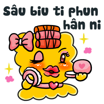
The project was completed with a strong focus on building a cohesive series of expressive icons that expand the brand’s visual language in a playful and emotionally rich way. Each character was designed as part of a larger system—sharing the same core shape, color palette, and signature details—while expressing different moods, phrases, and everyday moments.
This approach ensures consistency, recognizability, and long-term scalability for future communication needs.Rather than creating standalone illustrations, the icons were developed as a flexible series that can be used across chat platforms, social media, campaigns, and digital touchpoints. The completion stage refined expressions, gestures, and typography to make each icon instantly relatable and easy to use in conversation. Together, the set functions as a living visual toolkit, allowing the brand to communicate humor, emotion, and personality through a unified and highly memorable icon system


HIGHLIGHT
This project reimagines packaging as an interactive brand touchpoint, transforming Tok from a conventional snack product into a dynamic experience platform.
The new diagonal layout and bold graphic system not only enhance shelf visibility but also create a strong cutting-line emphasis, turning the act of opening the pack into a more intentional and visually engaging moment. Street-inspired typography and graffiti elements reinforce brand personality, making the packaging feel youthful, energetic, and culturally relevant to Gen Z.
Through this packaging innovation, Tok strengthens brand recall, encourages repeat purchase via gamified rewards, and builds a stronger emotional connection with young consumers—positioning packaging not just as a container, but as a core experience driver.