SUMMARY
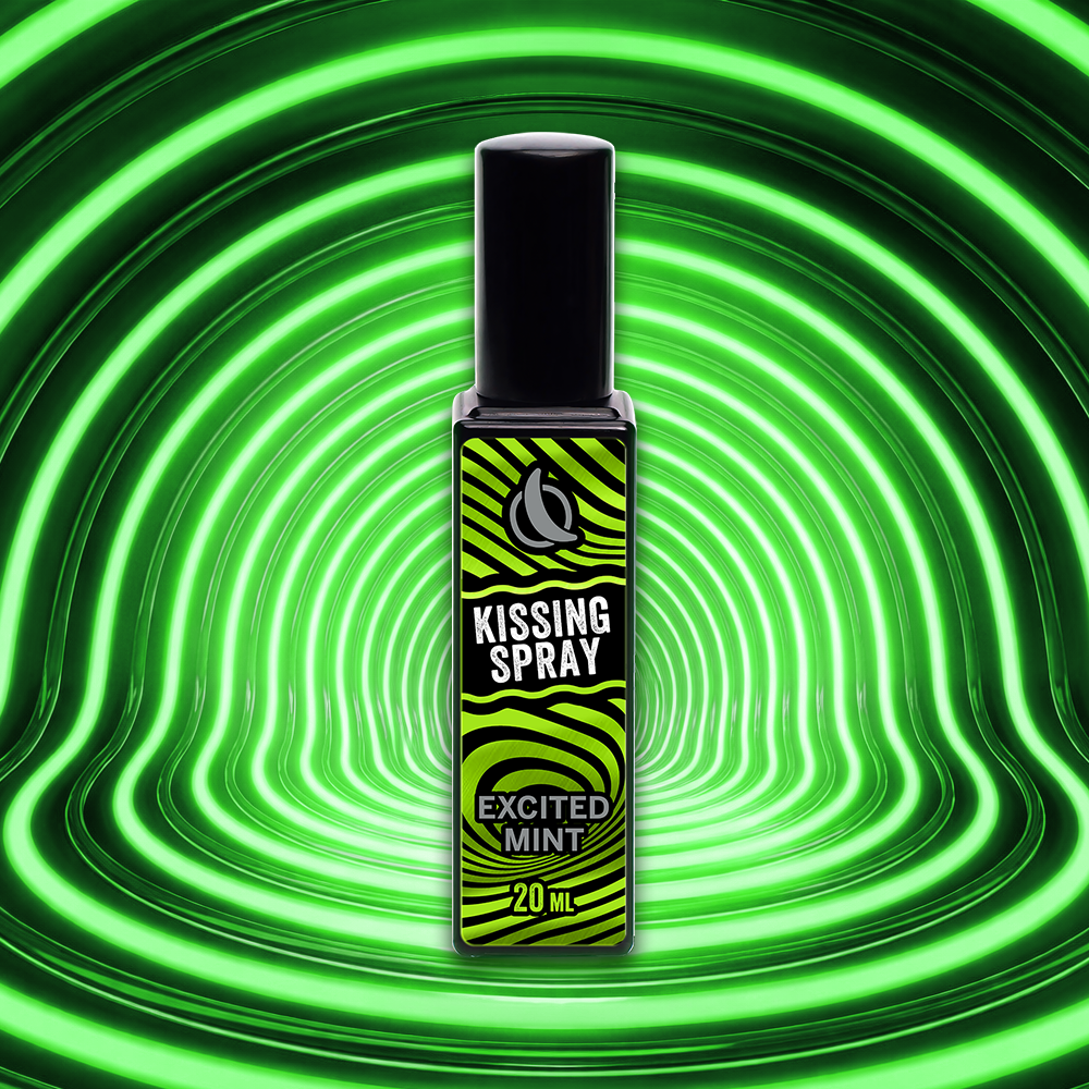
This project marks the bold debut of WOLFON – Yummy Couples Care, crafted to redefine intimacy-focused personal care through a confident and contemporary brand expression. 
Minimalist packaging combined with a striking neon-inspired aesthetic with sleek in key visual positions WOLFON as a modern and fashion-forward identity brand that speaks directly to young couples seeking both functionality and emotional connection. Beyond visual impact, the concept speaks directly to young couples who value both performance and emotional chemistry, positioning WOLFON as a daring yet tasteful companion in everyday intimacy. 
The project successfully builds strong brand recognition, elevates perceived value, and lays a powerful foundation for awareness in the personal care market.
INSPIRATION
WOLFON developed from the beginning with a moment that feels almost accidental — a glance held a second longer than necessary, a quiet recognition between lovers drawn together by instinct rather than intention.
No promises, no expectations. Just chemistry, unmistakable and immediate.Their encounter unfolds into an evening of movement and mood — wandering through the city, sharing stories between laughter and pauses, letting the night set its own rhythm. Every step side by side narrows the distance, every exchanged look deepens the unspoken connection. Desire simmers, never rushed, never forced.Then comes the playful tension — subtle touches, knowing smiles, a dance of approach and retreat. When intimacy finally arrives, it feels effortless and assured. No excess, no noise — only two bodies moving in harmony, fully present, fully aware. 
WOLF ON is not the center of the story, but the reason it lasts longer, feels deeper, and lingers in memory.
COMPLETION
The completion of Wolf On is the result of a deliberate and intimate design journey—one that balances instinct and refinement. 
At the heart of the logo lies a powerful duality which is generated by the ancient belief that when the moon rises, the wolf reveals itself, the crescent moon becomes a catalyst—an awakening. It represents the moment when confidence, strength, and masculine energy are fully activated to be ready to join into feminine attractions. Seen symbolically, it suggests connection, alignment, and completeness—two forces meeting seamlessly. Throughout the refinement process, every curve, weight, and negative space was polished to ensure the logo communicates performance without vulgarity, sensuality without excess. Wolf On does not shout desire—it signals readiness. 
The logo stands as a visual signature of that transformation—subtle, premium, and unmistakably bold.
HIGHLIGHT
This project successfully strengthened sales performance while accelerating brand awareness by positioning WOLF ON as a confident, premium solution in men’s intimate care. 
The bold visual system, neon-inspired storytelling, and clear product benefits helped the brand stand out on shelf and across digital touchpoints, driving strong attention and consideration. 
By clearly communicating cleanliness, freshness, and confidence, the campaign supported conversion at point of sale while reinforcing Wolf On as a modern, desirable brand that understands intimacy, self-care, and couple dynamics—turning awareness into purchase intent and long-term brand recall.
Orion | Tok Renewal Journey
[Brand Aesthetic Direction] This project redesigns Orion Tok with bold color blocking and dynamic flavor storytelling for strong shelf impact. An interactive QR challenge boosts engagement, driving impulse purchases and reinforcing Tok as a playful, energetic brand for trend-driven youth.
Orion | Giftset An Renewal Journey
[Brand Aesthetic Direction] This project introduces a premium festive packaging concept inspired by renewal and prosperity. Red-and-gold visuals and cultural symbols enhance emotional appeal, shelf impact, and brand recognition, strengthening Orion’s gifting presence and driving seasonal sales and long-term equity.
Orion | Moon Cake New Launch
[Brand Identity System] This project set a supreme image of Orion’s Mid-Autumn mooncake collection with a refined, contemporary visual inspired by moonlight and tradition. Premium gold tones and festival motifs enhance the gifting experience while reinforcing brand values of trust, craftsmanship, and togetherness.
AmorePacific | Mamonde Domestic Launch
[Digital Asset Delivery] This online campaign for Mamonde amplified its “Inspired by Flowers” philosophy through romantic, nature-driven visuals optimized for digital platforms. Designed to boost engagement and conversion, it strengthened brand storytelling, online visibility, and short-term sales performance.
Taisun | MëdiKind Global Launch
[Brand Aesthetic Direction] This project built a strong medical-grade identity for MediKind through soft clinical design and clear, trust-focused labeling. Applied across the full baby care range, it enhances shelf consistency, strengthens parental confidence, and positions the brand as a premium, healthcare-inspired solution.
AmorePacific | Laneige Annual Campaign
[Brand Identity System] This online project supported Laneige’s Shopee launch with strong e-commerce visuals and hydration-focused imagery. Designed to drive awareness, traffic, and conversion, it combined premium storytelling with clear calls-to-action to strengthen online presence and accelerate sales growth.
Taisun | Cozy Baby Global Launch
[Brand Aesthetic Direction] This project launched UniDry Premium’s Slim Magic Technology, highlighting its ultra-thin, high-absorption core and dermatological safety. Soft visuals and clear icons enhanced understanding, positioning it as an advanced, baby-safe solution for export markets like Australia and Europe.
Orion | Gouté Renewal Journey
[Brand Aesthetic Direction] This project marks Orion Gouté’s 15th anniversary with a limited-edition packaging design celebrating conceptual art and shared moments. Vibrant patterns and refined details elevate its premium image, reinforce heritage, and enhance desirability as a sophisticated gift choice.
Orion | Marika New Launch
[Brand Identity System] This project elevates Orion Marika Flower Cookies with premium royal blue and gold packaging and an octagonal tin design. Highlighting New Zealand butter and refined mastery, it enhances gifting appeal, shelf presence, and consumer trust in quality.
Orion | CestBon New Launch
[Brand Identity System] The C’est Bon! Baguette project launched a European-inspired bakery breakfast meal blending French–Italian flavors with café-style visuals. Authentic taste cues and cohesive packaging enhanced shelf impact, strengthened brand recognition, and positioned it as a refined yet accessible indulgence.
Back to Top